

Interactive weather maps for your website
From storm squalls to pollen load - for a long time now, a weather map has to be able to do more than display precipitation and temperature for the next few days. Use the visualization of weather data to create real added value for your website.
Individual solutions for complex requirements


With an optimized weather map, you can offer your website users real added value and increase customer loyalty in the long term. From travel and vacation weather to pollen counts - weather maps offer users a high level of information. But there are big differences in the way weather data is presented - your chance. We can help you develop weather maps that meet user needs. With 15 years of experience in developing interactive maps, we know that applications must be intuitively understandable in order to be accepted by users. With partners like wetter.com we develop individual solutions that take into account your requirements and our experience.
Your advantages when you implement a solution with our experts:


- Consideration of various restrictions & parameters
- Optimal technology stack
- Flexible and extensible solutions
- Self-explanatory user interface
- Easy handling for high user acceptance
- As an independent partner, we select the right provider for your requirements
- One-time development price
Customer projects
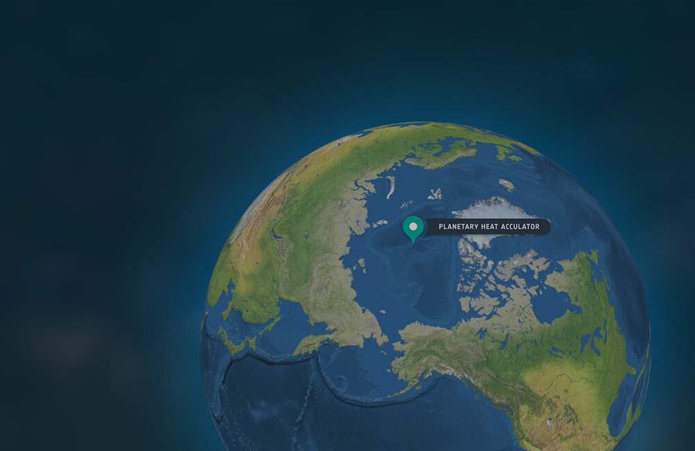
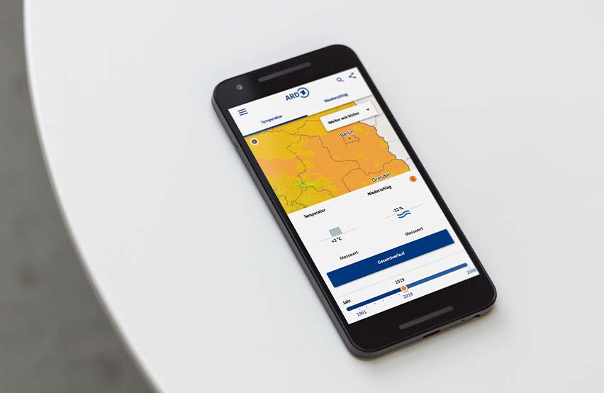
From ARD to the European Space Agency: There are many use cases for the visualization of weather and climate data. We present some project examples here.


From design review to full map development
The following steps show which building blocks are possible during development and optimization. Fast results can already be achieved with a few important optimizations; beyond that, interactive maps with time series and forecasts in particular offer added value.
Step 1: Assessment
Starting with a design review, some important optimization points can already be identified. A simple check of design (contrasts, comprehensible UI elements), performance and behavior on different device sizes enables first quick wins.
Step 2: Optimization to prototype
Existing and new map applications should be designed and optimized so that they are easier for users to understand. This includes, among other things, the reduction of information and a good design. We are happy to create a design proposal and prototype with static data.
Step 3: Interactive maps
Only when users interact with the map does it become a real tool. Functions include zooming in and out, searching for locations, zooming out with corresponding data display, and switching between different values such as temperature and precipitation. We take care of design, development, implementation and integration.
Step 4: Time Series & Forecasts
Time series and forecasts require the greatest effort in development, as large amounts of data are animated here. To ensure this, a good infrastructure is needed to ensure that the data volumes are captured and transmitted well. We have the experience to build a performant map that maps large amounts of data in high spatial resolution and in time steps.


